
Thousands of files in a heap
Over the years, the font folder fills up with duplicates, damaged files and fonts without accents. Windows slows down when they’re all installed, and the one you want is never where you look.
Critical PHP vulnerability — 21 October 2026
Software for Windows 10 and 11 · Mac version coming soon · developed by FFSMC
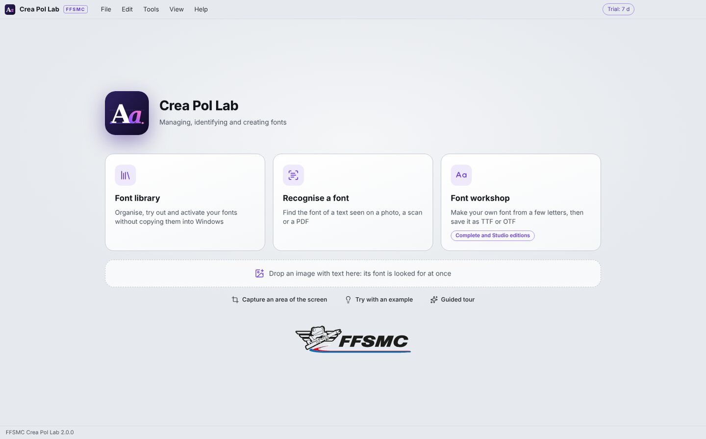
A shop sign, a poster, an old marking: Crea Pol Lab reads the text in the photo and tells you which font looks most like it. It organises your fonts, even thousands of them, and activates them in Windows without copying them. And if the font doesn’t exist, it makes it from a few letters, or from your own handwriting.
A few letters in a photo are enough: the others are drawn for you, with the same stroke weight and the same width.
During the trial every function is unlocked, the font workshop included. · From 59,00 € lifetime licence, 1 computer

Over the years, the font folder fills up with duplicates, damaged files and fonts without accents. Windows slows down when they’re all installed, and the one you want is never where you look.
A shop sign, a poster, a label, the marking on a model: you like the font, but nothing tells you its name. Trying your fonts one by one, by eye, takes hours.
The lettering on an old plate, a hand-painted sign, a family member’s handwriting: no font matches. Then it has to be redrawn, letter by letter, and that’s a trade of its own.
Three jobs in one piece of software: organise, recognise and create. Every button has its help bubble, and the F1 key opens the built-in help.
Recognise a font
Open the photo, scan or PDF, or simply drag it into the window. Crea Pol Lab reads each line of text, then compares it with every font on your computer. The nearest ones are listed from the most to the least similar, with a percentage.
Under each suggested font, the text of your image is written in it: compare it by eye with the thumbnail at the top, and the right font stands out at once. A misread letter is corrected in the text box, and the comparison is done again.
In every edition

Seen on screen, found on the Web
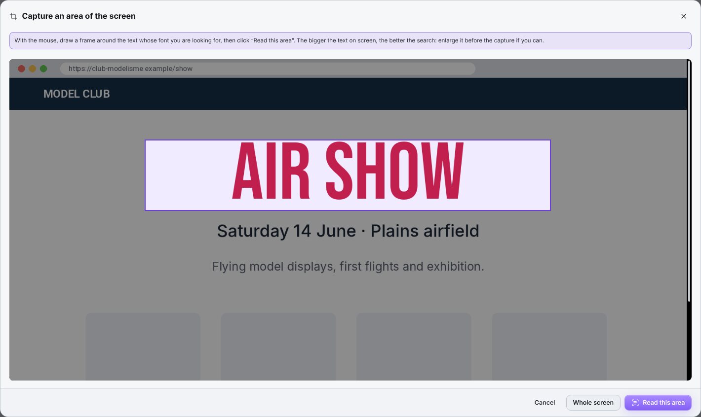
No need to save a picture: the “Capture an area of the screen” button takes a picture of the screen, you frame the text, and it is read like an ordinary image.
When no font on your computer looks like the text, Crea Pol Lab searches the free, open-licence fonts published on the Internet. The one you like is downloaded and stored in your font folder, with a note of its licence.
In every edition; “Create in the workshop” from Complete

The library
Point it at the folder where you keep your fonts, sub-folders included: the list fills up with the name, style and number of characters of each one. Type a few letters to find a font, click it to see it large with your own words.
“Activate in Windows” makes it available in Word, Illustrator or your embroidery software without copying the file: Windows only knows where to find it. “Remove from Windows” takes it out again, and the file itself is never deleted.
In every edition

The sheet
The “Sheet” display shows all your fonts at once, each one written with your trial text: the name of your club, the title of a poster, a name to embroider. Type it once and every thumbnail changes.
Mark your favourites with a star, gather the fonts used together into collections (a wedding, a rally, a series of models), and sort by style, weight or character. A whole collection can be activated in Windows in one go.
In every edition
Choosing on paper
The “Compare” button shows two fonts side by side with the same text, their number of characters and whether the French accents are there. It’s easier to decide when you see them together.
A PDF specimen sheet can be printed or sent: your text in five sizes and the whole alphabet for one font, eight fonts per page for a list. It’s the simplest way to have a choice approved by a customer, a club committee or a printer.
In every edition

The font workshop
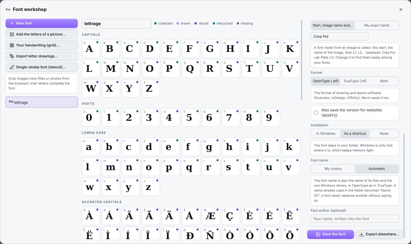
Give the workshop a photo, scan or PDF where letters can be seen: an old poster, a plate, painted lettering. Every letter read clearly joins the font. Your drawings made in Illustrator or Inkscape, or scanned from paper, can be added too.
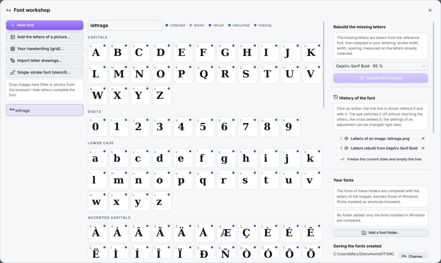
One click on “Rebuild” then fills every empty box: capitals, lower case, digits, accented letters and signs. They are drawn from the nearest font on your computer, then adapted to your letters: same stroke width, same width, same spacing. Accents are placed on their own.
Complete and Studio editions


Your handwriting
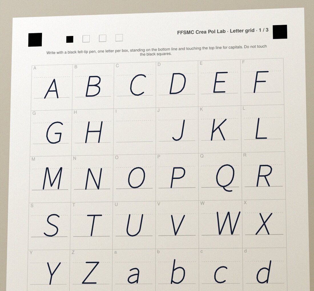
The workshop prints a three-page grid. You write one letter per box with a black felt-tip pen, then scan or photograph the pages. The software doesn’t need to read your handwriting: it knows which letter goes in which box.
Your letters arrive in the table, and the characters you didn’t write are completed from the nearest font. Don’t like a letter? Write it again on a new grid and read only that page.
Complete and Studio editions

Save and install
“Save the font” makes the file and installs it in Windows according to your settings. Close and reopen Word, Illustrator or your embroidery or cutting software: your font is in the list, like any other.
The workshop also makes single-stroke fonts, in which every letter is drawn with one stroke, as with a lettering stencil: perfect for machines that write with a pen, for plans and technical labels. And the history keeps every action: take it out, put it back, without touching the rest.
Complete and Studio editions

Getting started
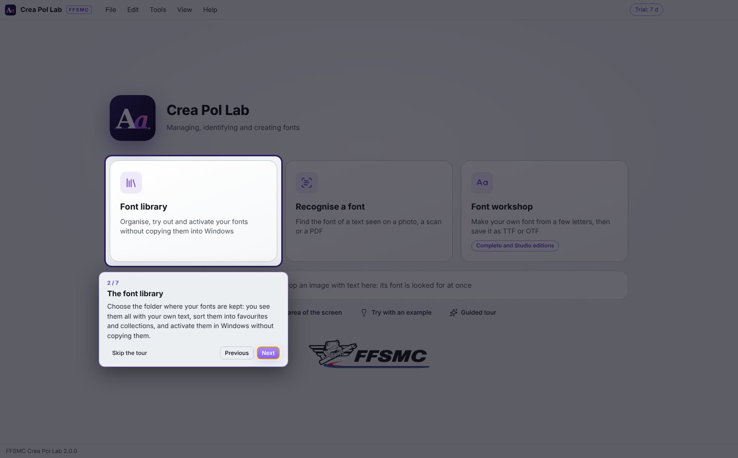
The very first time you start it, a guided tour shows you the home screen in seven steps. After that, just hold the mouse still over a button or a setting for a moment: a bubble tells you what it is for.
Three example pictures come with it (a bakery sign, a poster and a few letters) so you can try everything without preparing anything. And when something goes wrong, the message offers, whenever it can, a button that does what is needed.
In every edition


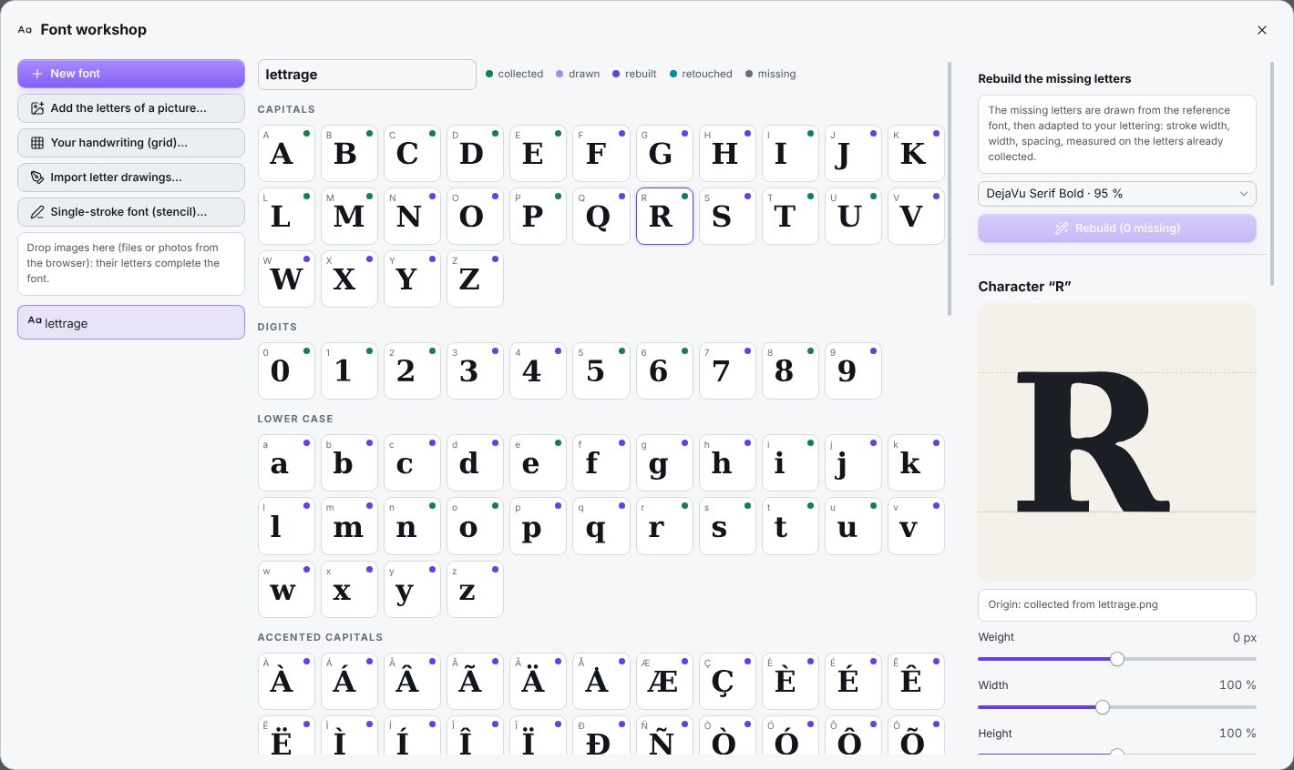
Screenshots of the software as you will install it, version 2.0.1. Click to enlarge.
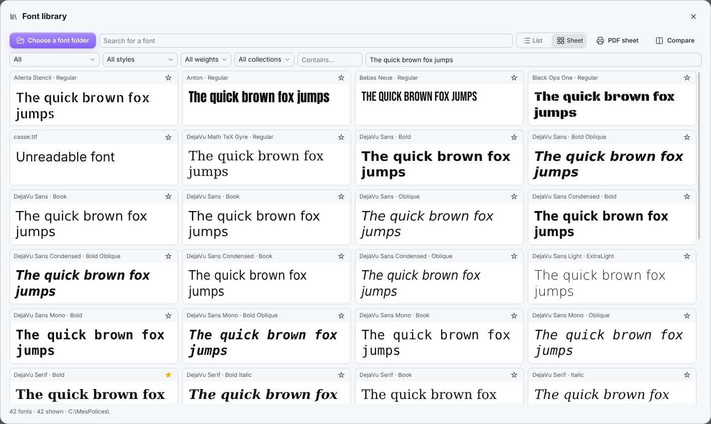
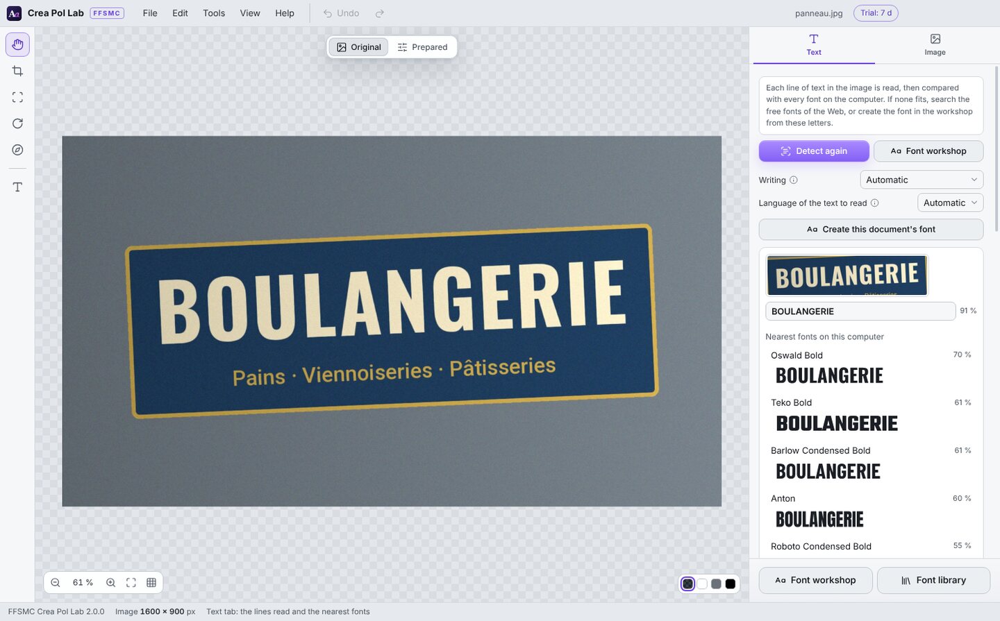
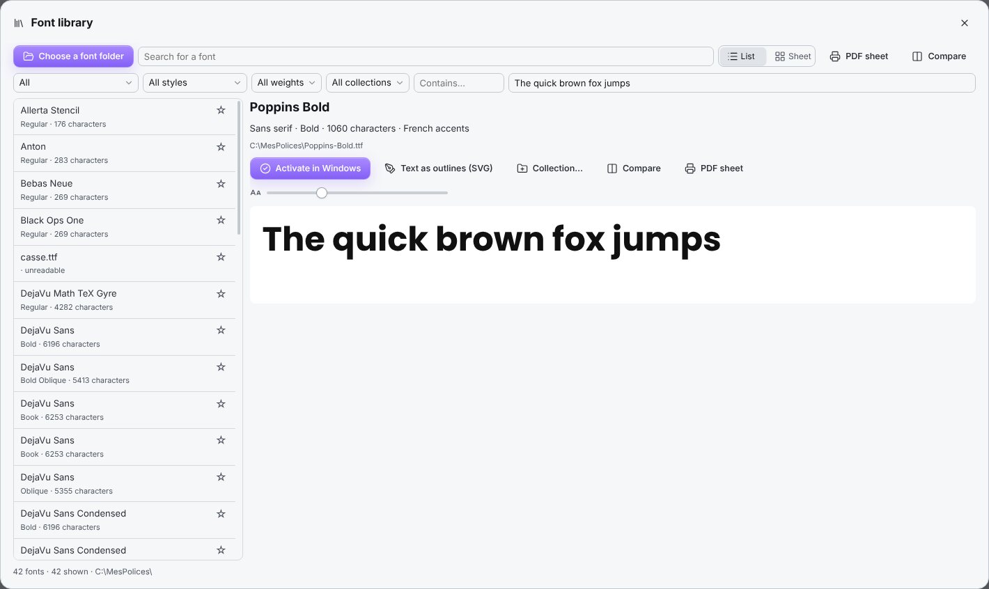
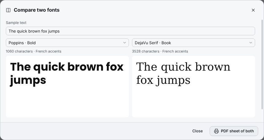
Software that handles your fonts shouldn’t disturb anything. Crea Pol Lab leaves your files where they are.
Fonts are read straight from your folder. Activating them doesn’t copy them into Windows, and removing them never deletes the file.
Deleting a collection deletes only the collection, never the fonts it held.
In the workshop, the history keeps everything you’ve done. An action can be switched off or deleted without touching the others, and Ctrl+Z undoes.
The fonts you make are yours. The free fonts offered by the software are open-licence, commercial use included, and come with a note of their licence.
Each edition contains everything in the one before. You buy the licence once; updates are included for one year.
Organise and recognise your fonts.
59,00 € lifetime licence, 1 computer
For anyone with lots of fonts who wants to find the one in an image.
Recommended
Every function, workshop included.
89,00 € lifetime licence, 1 computer
The edition we recommend: sooner or later, you nearly always want to create a font.
Complete on three computers.
119,00 € lifetime licence, 1 computer
Lifetime licence valid on 3 computers: the workshop, the laptop and home, or three people in a small team.
The licence covers the number of computers of the edition you choose. To change computer, first deactivate the old one in Help › Licence…. After a year, nothing stops: the licence is for life. Only the updates included with your purchase come to an end. To move up to a higher edition later, you only pay the difference.
| Function | Essential | Complete | Studio |
|---|---|---|---|
| Font library: list, search, preview with your text | |||
| Activate and remove in Windows, without copying the files | |||
| Library check: duplicates, broken files, fonts without French accents | |||
| Sheet: every font written with your text | |||
| Favourites and collections | |||
| Sorting by style, weight and character | |||
| Comparing two fonts and PDF specimen sheet | |||
| Recognising a font in a photo, a scan or a PDF | |||
| Capturing an area of the screen | |||
| Searching for free fonts on the Web | |||
| Text to curves (SVG) | |||
| Guided tour, help bubbles, examples and user manual | |||
| Workshop: a font from the letters of an image | — | ||
| A font from your letter drawings | — | ||
| A font of your handwriting, with the grid to fill in | — | ||
| Single-stroke fonts (stencil) | — | ||
| Missing letters drawn automatically, retouching letters | — | ||
| OTF, TTF and WOFF2 export | — | ||
| Three computers | — | — | |
| Edition | 59,00 € | 89,00 € | 119,00 € |
Download the installer and double-click it: Crea Pol Lab runs for 7 days with every function, the workshop included. When Windows asks for your permission, check that the publisher shown is “Christophe Queyroi”, then click “Yes”. On first launch, Windows may show “Windows protected your PC”: click “More info”, then “Run anyway”. The program is signed in the name of Christophe Queyroi.
Taken from the user manual, these moves save time from your very first day.
No picture to hand? Three examples are supplied: a bakery sign and a poster for recognising fonts, and a few letters for the workshop.
Where Help › Examples, or the “Try with an example” button on the home screen
Wondering what a button does? Hold the mouse still over it for a moment: a pale yellow bubble tells you what it is for.
Where Everywhere in the software
Drag an image from Windows Explorer into the dotted frame on the home screen: the software looks for its font at once. A copied image is pasted with Ctrl+V.
Where Home screen, dotted frame
A sign photographed from below distorts the letters. Straighten the photo and crop to the text before detecting again: the font is recognised much better.
Where Image tab › Straighten automatically; Straighten (P) and Crop (C) tools
Take the “T” tool and draw a frame around the text, holding the mouse button down: it is read in turn.
Where Left-hand bar, “T” tool
Under each suggested font, your text is written in it. Compare it with the thumbnail at the top: the right font stands out, even when two percentages are close.
Where Text tab, under each line read
For a font seen on a web page, show the text as large as possible before capturing. With two screens, the one where the mouse is gets captured.
Where Tools › Capture an area of the screen… (Ctrl+Shift+E)
Keep your fonts in a folder that stays put, for example C:\MyFonts. If you move or rename it, Windows no longer finds the activated fonts.
Where Library › Choose a font folder
Type the name of your club or the title of your poster in the trial box and switch to “Sheet”: every thumbnail changes at once, and the choice becomes obvious.
Where Library › Sheet, trial box
Click a font’s star ☆ to add it to your favourites, then choose “★ Favourites” in the first list to see only those.
Where Library, first drop-down list
Gather the fonts of a project into a collection, and activate them all in one go on the day you work on it. Remove them afterwards to lighten Windows.
Where Library › Collection…; “Activate the collection” band
For a text in Polish, German or with a symbol, type the characters into “Contains…” and press Enter: you will only see the fonts that have all of them.
Where Library, “Contains…” box
A PDF specimen sheet, printed or sent, is the simplest way to have a font approved by someone.
Where “PDF sheet” button, in the top bar or next to the preview
Text to curves (SVG) holds the drawing of the letters: it opens on the cutting machine’s computer or at the printer’s, even if the font isn’t installed there.
Where Library › Text to curves (SVG)
For the workshop, use sharp images taken straight on, where the letters are at least 60 pixels high and don’t touch. Several images are better than one: the letters add up.
Where Workshop › Add the letters of a picture…
Before clicking “Rebuild”, look at the font suggested and its percentage. If another one in the list seems closer to the spirit of your letters, take it.
Where Workshop › Rebuild the missing letters
In the table, the coloured dot tells you where a letter comes from: green collected from an image, purple drawn, blue rebuilt, cyan retouched. Grey boxes are still missing.
Where Workshop, table of characters
A medium black felt-tip pen gives far better letters than a ballpoint. Print the grid at actual size, without “Fit to page”.
Where Workshop › Your handwriting (grid)…
When the font suits you, “Freeze the current state and empty the tree” lightens the history: the font stays exactly as it is.
Where Workshop › History of the font
Folder, format, installation, author’s name: these settings are kept for the next fonts. Remember to tick WOFF2 if the font is also meant for a website.
Where Workshop, bottom of the right-hand column
The software can’t do better than the picture you give it. A few precautions when you take the photo or the scan save a lot of retouching.
Stand right in front of the sign or the page. If that isn’t possible, straighten the photo in the software before running the recognition.
Get closer or zoom in: the letters should fill a good part of the picture. For the workshop, allow at least 60 pixels of height per letter.
A blurred picture, or one taken from too far away, gives nothing good. A second photo is better than hours of retouching.
Keep only the useful part of the picture: the text is found more surely, and the comparison is quicker.
For your handwriting, scan the pages or photograph them lying flat, straight on, without strong shadows. The four black squares in the corners must stay visible.
After activating or installing a font, close Word, Illustrator or your embroidery software completely, then open it again: they only read the list of fonts when they start.
What people ask before buying, and what they look for once the software is installed. Type a word or pick a topic.
Three things. It organises all your fonts and lets you try them, even if there are thousands. It finds the name of a font seen in a photo, a scan, a PDF or on screen. And it makes your own font from a few letters: those of an old poster, a plate, hand-drawn lettering, or your own handwriting.
No. A guided tour shows you the home screen the first time you start it, every button has its help bubble, and examples are supplied. The illustrated user manual takes you step by step: read it once from start to finish with the software open beside it, and in about an hour you will know how to do everything.
Yes. Download the installer from this page: Crea Pol Lab works for 7 days with every function, the font workshop included, free of charge. The number of days left is shown at the top right of the window.
You buy the licence once, with no subscription: €59 for Essential, €89 for Complete, €119 for Studio (Complete on 3 computers). Updates are included for one year.
No. Crea Pol Lab is software for Windows 10 and 11, 64-bit.
Only to activate the licence, to search for free fonts on the Web, and now and then to check the licence. Everything else works without Internet: the library, recognition with your own fonts, the workshop.
Click the “Recognise a font” tile on the home screen and choose the photo, scan or PDF. You can also drag the image into the dotted frame, or paste it with Ctrl+V. The software reads each line of text and compares it with every font on the computer. For each line, the nearest fonts are shown with a percentage, and your text is written in each of them.
Above 85%, it is almost always the right font, or a very close cousin. Between 70 and 85%, the general shape is right but a detail differs: a variant, another weight. Below that, the original font is probably not on your computer: look for it on the Web, or recreate it in the workshop.
It compares the fonts installed in Windows. To add a folder of fonts that are not installed, open the font workshop and click, on the right, “Add a font folder” (under “Your fonts”).
Straighten it first: “Image” tab, “Straighten automatically” button. If the result doesn’t suit you, take the “Straighten a skewed photo” tool (P key), drag the four handles onto the corners of the sign and press Enter. Crop to the text with the “Crop” tool (C key), then go back to the “Text” tab and click “Detect again”.
Show the text as large as possible, then click “Capture an area of the screen” under the dotted frame of the home screen (or Tools › Capture an area of the screen…, Ctrl+Shift+E). Draw a frame around the text and click “Read this area”: it is handled like an ordinary image.
Click “Search the web” under that line: the text is compared with the free, open-licence fonts published on the Internet. Click “Save” next to the one you like: it is stored in your font folder with a note of its licence, and all that is left is to activate it. If nothing looks right, the font is probably a commercial one: “Identify online” opens a specialist website that also knows commercial fonts, and “Create in the workshop” recreates it from the letters of the image.
The image is too small, too blurred or taken from too far away. Crop to the text, straighten the photo, or use a larger image.
No. When you click “Activate in Windows”, the file stays where it is, in your folder: Windows only knows where to find it. You can keep thousands of fonts without cluttering the computer, and activate only those you need for a piece of work. “Remove from Windows” takes it out without ever deleting the file.
Yes. The list shows 400 fonts at a time: beyond that, use the search. The sheet shows 300 at a time, drawn as they come into view, and the “Show 300 more fonts” button shows the next ones. It stays fast, even with thousands of fonts.
With the drop-down list at the top left of the library: “Duplicates” shows the same font present several times, “Unreadable or broken” the damaged files, “Without French accents” those lacking é, è, à, ç… Keep one copy of each duplicate, and download the broken files again from their original site.
To group fonts that are used together: a wedding, a flying club, a series of models. Click a font, then “Collection…” › “New collection…”. When you choose the collection in the “All collections” list, a band lets you activate it in Windows in one go, remove it, or print its PDF sheet. The fonts stay in your folder: deleting a collection never deletes the fonts.
Click the font, type your text in the trial box, then click “Text to curves (SVG)”. The file holds the drawing of the letters, not the font: it opens in Illustrator, Inkscape or the software of a cutting machine, on any computer.
A few are enough. The missing boxes are filled by “Rebuild”: capitals, lower case, digits, accented letters and signs, drawn from the nearest font on your computer, then adapted to your letters (same stroke width, same width, same spacing). The more letters you give, the more the font keeps its character.
A sharp image where the letters are at least 60 pixels high and well apart from each other. A photo taken straight on gives better letters than one taken at an angle. You can add several images: the letters add up, and a letter read better replaces the previous one.
Click it in the table. The “Weight”, “Width”, “Height”, “Vertical position” and “Spacing” sliders adjust it, and the trial line shows the result in a word at once. “Retouch” opens a brush to add or erase a piece; “Draw” lets you redo it entirely with the mouse or a tablet. A misread letter is deleted with the bin, then “Rebuild” draws it again.
OpenType (.otf) for drawing and layout software, TrueType (.ttf) for most embroidery and cutting software, or both. If you tick “Also save the version for websites (WOFF2)”, you also get a .woff2 file, to give to the person who makes your website.
Yes: it is a real font, usable in Word, Illustrator, embroidery and cutting software like any other. For those programs, TrueType (.ttf) is usually the better choice. For machines that write with a pen, the workshop also makes single-stroke fonts, in which every letter is drawn with a single stroke.
The fonts you make belong to you. For a downloaded font, respect its licence: the free fonts offered by the software are open-licence, including for commercial use.
In the workshop, click “Your handwriting (grid)…”, then “Print the grid to fill in (PDF)…”. Print the three pages at actual size, write one letter per box with a black felt-tip pen, then scan or photograph the pages. Go back to “Your handwriting (grid)…” › “Read a filled-in grid (scan or photo)…” and choose the three pictures in one go, or a three-page PDF. The characters you didn’t write are completed from the nearest font.
No. It knows which letter goes in which box: even handwriting that is hard to read gives a font. The small grey character in the corner of each box tells you what to write.
Print without “Fit to page”. Write with a medium black felt-tip pen (a ballpoint is too thin), one letter per box. Stand each letter on the bottom line; capitals touch the dotted line at the top, and g, p or y go down below the line, as in a school exercise book. Don’t touch the four black squares in the corners. A box left empty is simply ignored.
The photo must show the whole sheet, with its four black squares. Photograph it lying flat, straight on, without strong shadows and in good light, or scan the page.
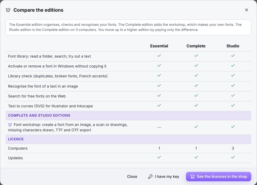
Essential is enough to organise your fonts, activate them, compare them and find the one in an image. Complete, the one we recommend, adds the workshop that makes your fonts: from an image, your drawings or your handwriting, as OTF, TTF and WOFF2. Studio is Complete on three computers. Help › Compare the editions… shows all three side by side.
Yes, at any time, by paying only the difference. The new key is entered in Help › Licence… and replaces the old one, with nothing to reinstall.
After buying on ffsmc.fr, you receive an e-mail straight away with your key, in the form XXXX-XXXX-XXXX-XXXX. In the software: Help › Licence…, paste the key into the “Licence key” box (Ctrl+V), then click “Activate”. The badge at the top right then shows your edition.
On the old one: Help › Licence… › “Deactivate this computer”. Then activate the key on the new one.
Download the installer from this page and double-click the file FFSMC-Crea-Pol-Lab-Setup in your “Downloads” folder. Windows asks whether you allow the program to make changes: the publisher shown is “Christophe Queyroi”, that is, FFSMC, so click “Yes”. Choose your language and follow the screens. The software is digitally signed.
Yes. From the Store, just click “Install”, and the Store then takes care of the updates, with nothing for you to do.
Once a day, Crea Pol Lab checks whether a new version exists. If so, it offers “Install now”, “Later” or “Skip this version”. The new version is installed over the old one, and your fonts and settings are kept. To turn this check off or back on: Help › Tell me about new versions. To check yourself: Help › Check for updates.
Write to [email protected]. Describe what you were doing and, if possible, attach a screenshot (Print Screen key, then Ctrl+V in your e-mail). We answer quickly, in English or in French.
Close Word completely (all its windows), then open it again. Programs only read the list of fonts when they start.
Your font folder has probably been moved or renamed: Windows can no longer find them. Open the library on the new folder and activate them again.
A font with the same name may be open in a program. Close Word, Illustrator and the others, or give your font another name.
Some video players protect their picture. Pause the video, press the Print Screen key on your keyboard, then paste the picture into Crea Pol Lab with Ctrl+V.
No question matches. Write to us at [email protected]: the answer will help the next person too.
Christophe Queyroi developed Crea Pol Lab so that finding or recreating a font no longer calls for any special knowledge. FFSMC is a very small French company: support answers quickly, in English or in French, at [email protected].
Seven days, every function unlocked, to organise your fonts, find the one on your sign and create your own.
Try it free